

Cosmic Atlas
Web design & development

A digital guide to astronomy, Cosmic Atlas is an interactive, informative website.
Vscene
UX/UI design
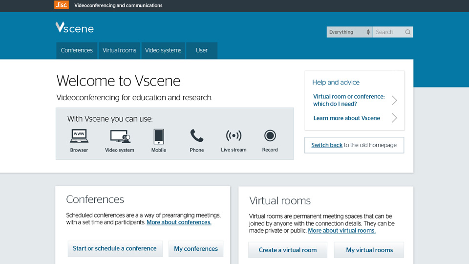
Redesigning the web-based videoconferencing service Vscene.
Sound Waves of Music
Data visualisation

A data visulisation project about one of my personal passions, music.
Pet Project
Marketing posters

A project to create a 360° campaign encouraging a wide audience to adopt pets.
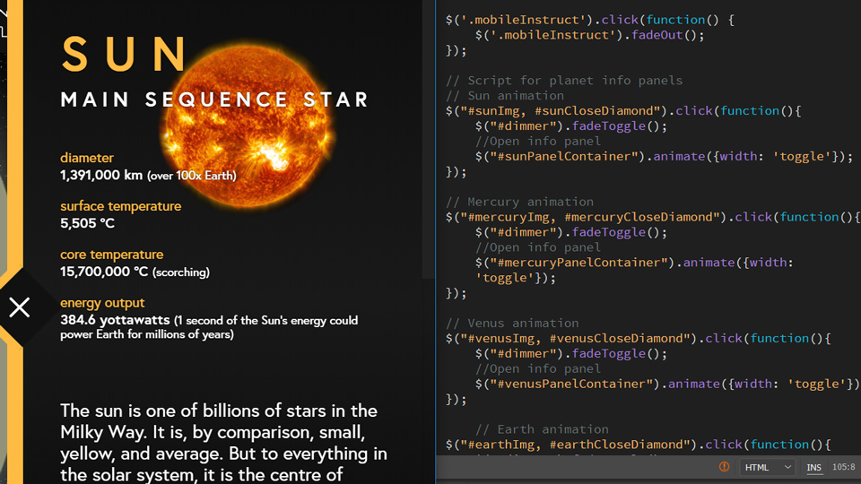
Cosmic Atlas
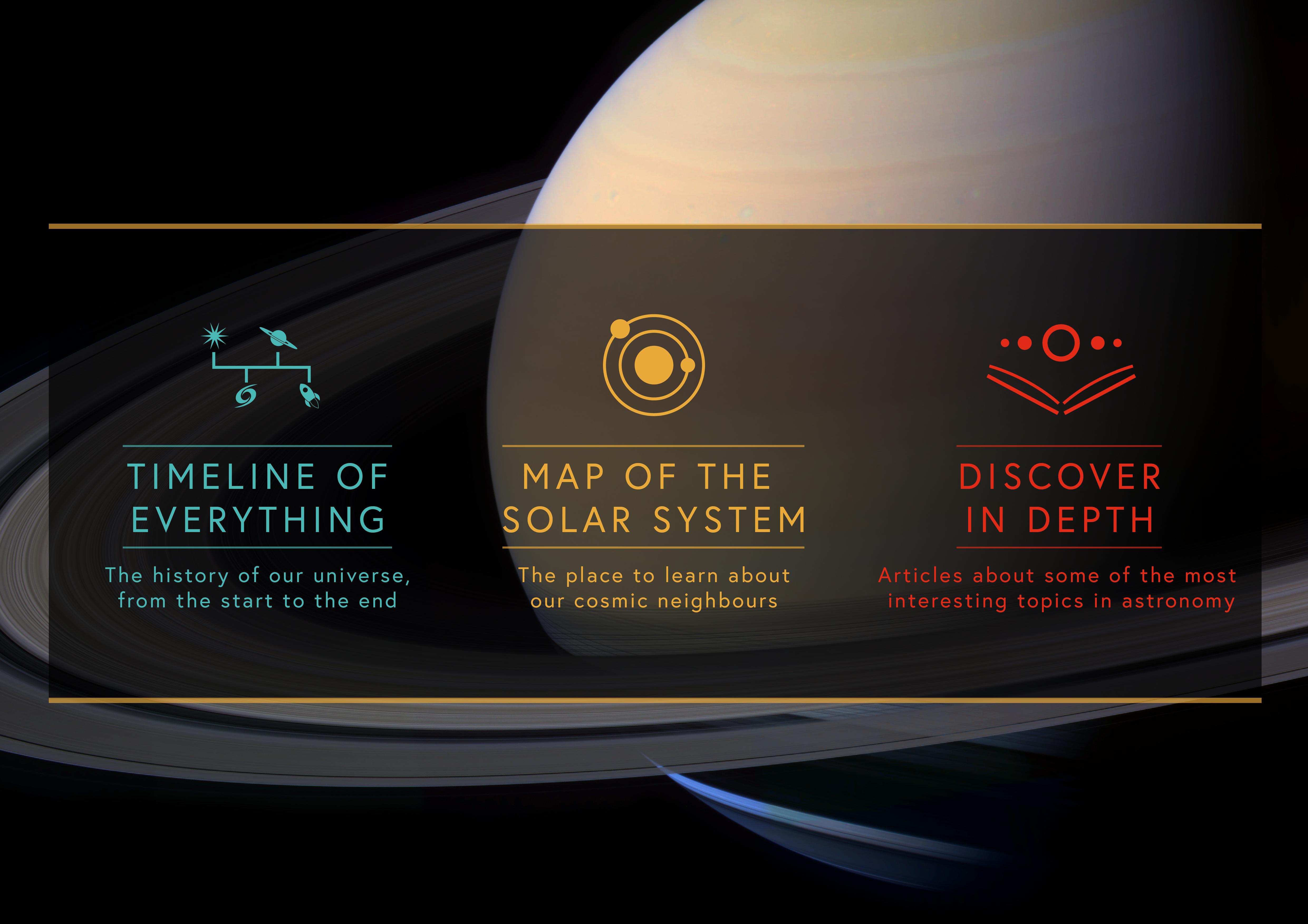
Cosmic Atlas is an interactive guide to astronomy.
It was born from my personal love of all things astronomical, and aims to inform the user of some of the subjects I find most fascinating about space.
The three sections offer real depth of knowledge, presented graphically.
Design
Structure, navigation, and graphic design.
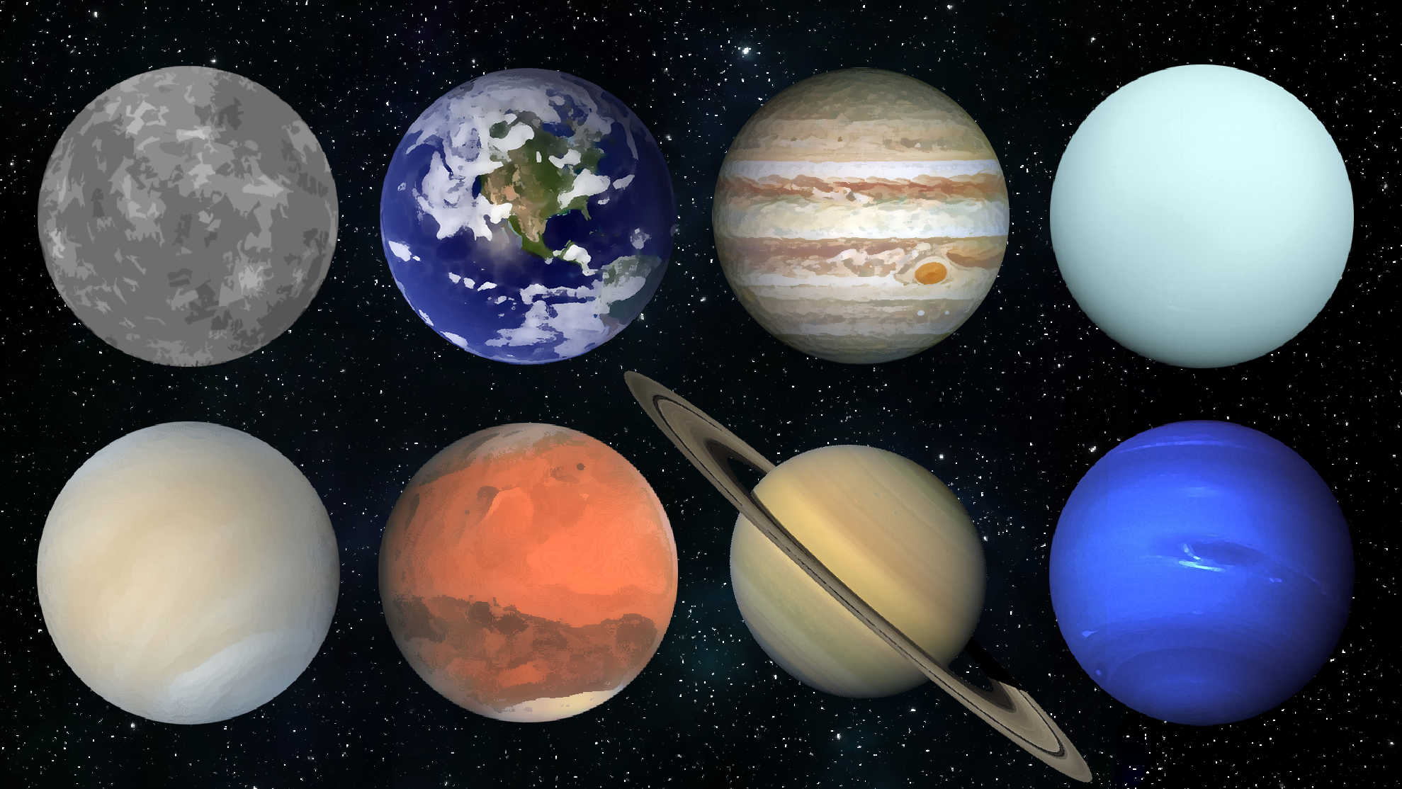
With Cosmic Atlas, I tried to subvert the expected visual style of a space website by using a wide pallette of strong colours.
Vscene
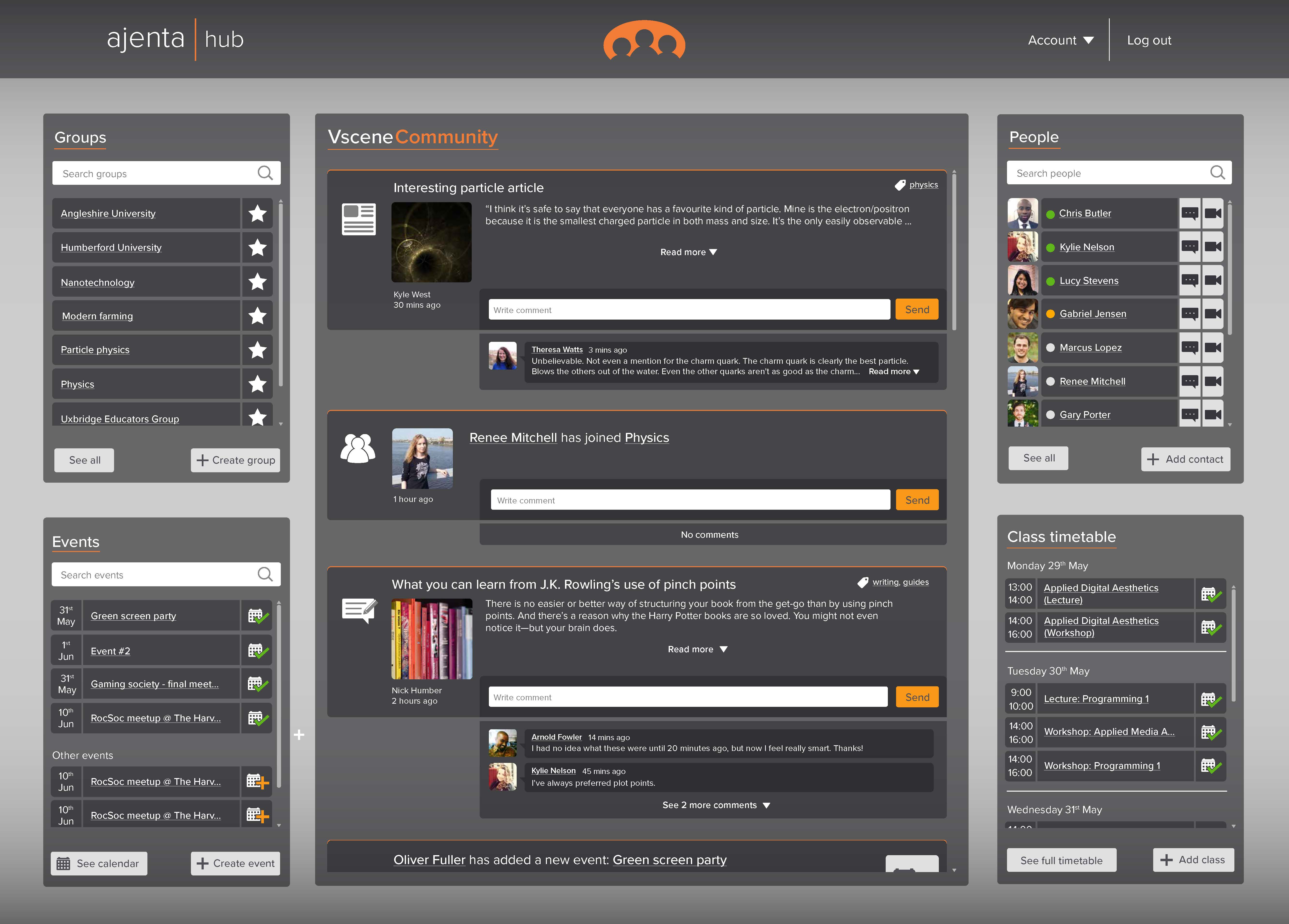
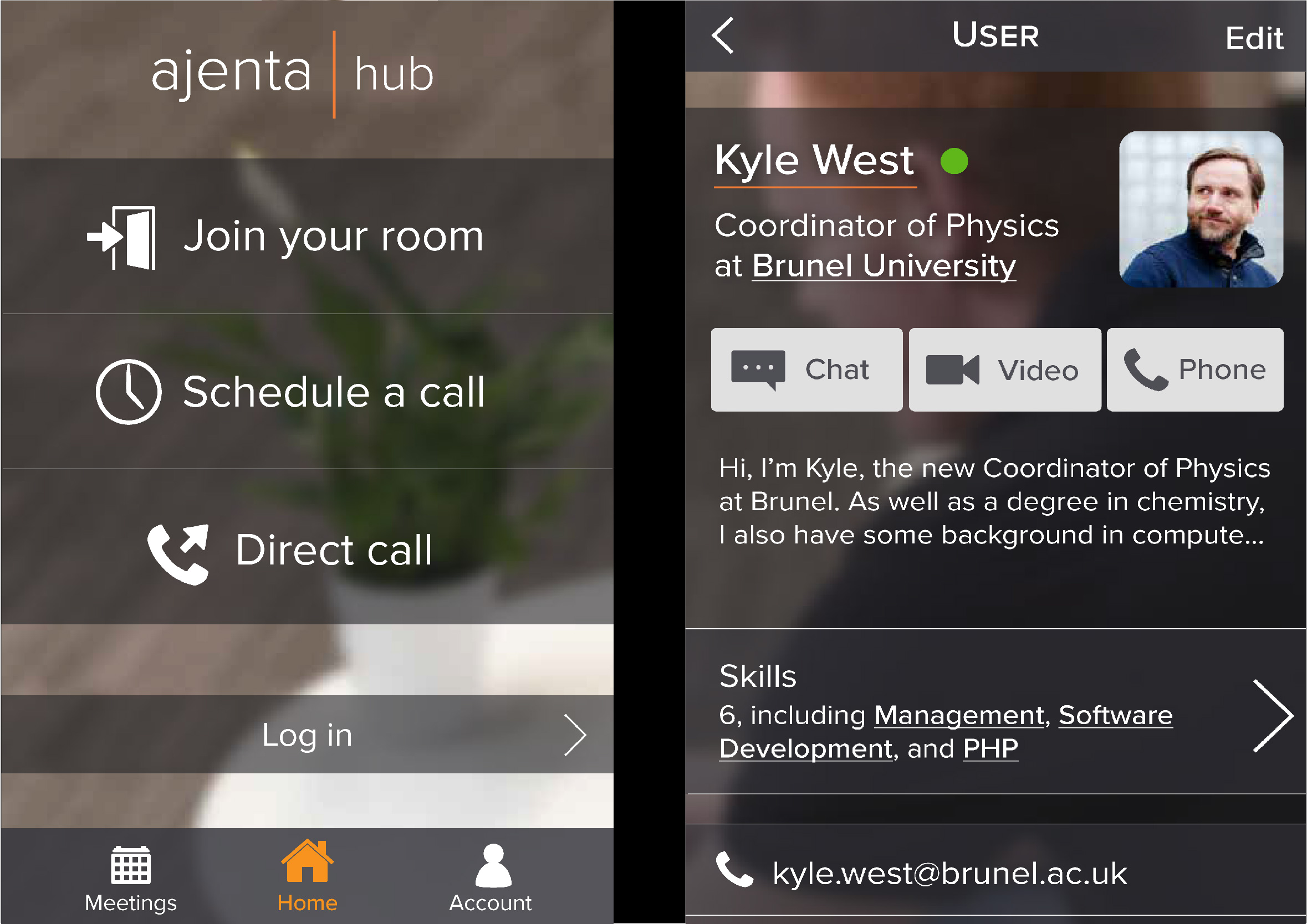
In my year at Jisc Technologies, I was tasked with redesigning the user interface and experience of Jisc's videoconferencing service, Vscene. I also created the basis of a social network for Jisc's partner, Ajenta.
The constraints of working on Vscene were a double-edged sword: while working within a strict style guided my designs well, it was also very limiting in the design elements that I could use.
Making Ajenta Hub allowed me more freedom in the layout, though I think some more styling could really improve the images.
User Interface
Designed with the user in mind.
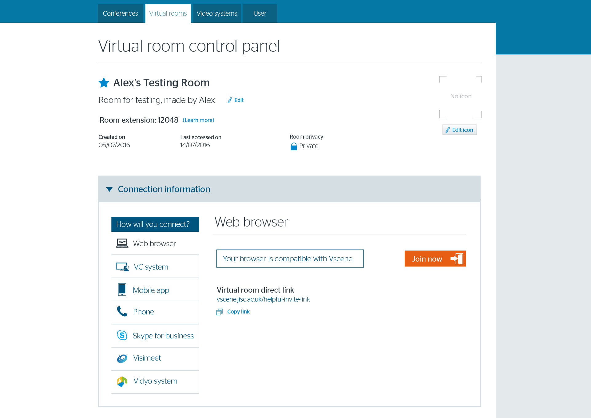
Starting from the existing, poorly-optimised web pages, I tore each one up and laid it out again according to UI/UX principles.
Sound Waves of Music

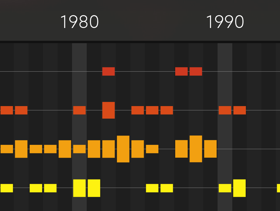
The Sound Waves of Music infographic visualises the popularity of different music genres throughout time.
Each bar shows how many songs from each genre made it into the top 5 of the Billboard singles chart for that year.
Ideation
Finding my topic.
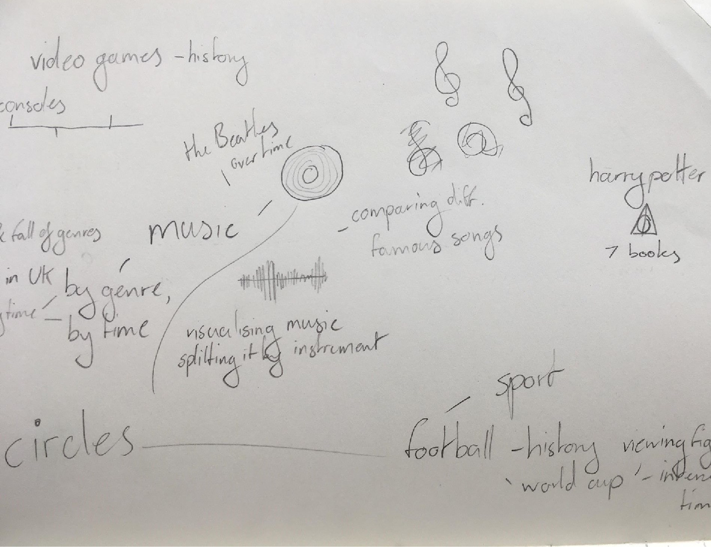
The idea for this data visualisation came from mind mapping everything that I've ever been interested in that could be displayed numerically.
I also considered sports, video game history, and Harry Potter, but once I'd hit upon the 'sound waves' display, it could only be music.
Design
Showing the data effectively.
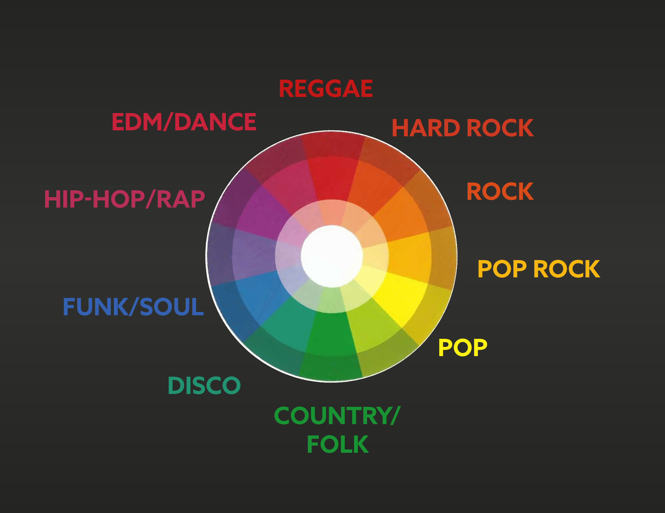
A wide range of colours on a neutral background allow for strong colour coding, and for the viewer's eye to follow the horizontal coloured bar for each genre.
I played with the idea of displaying individual subgenres on the chart, but rejected it for being needlessly detailed: simplicity and clarity was more important.
Pet Project
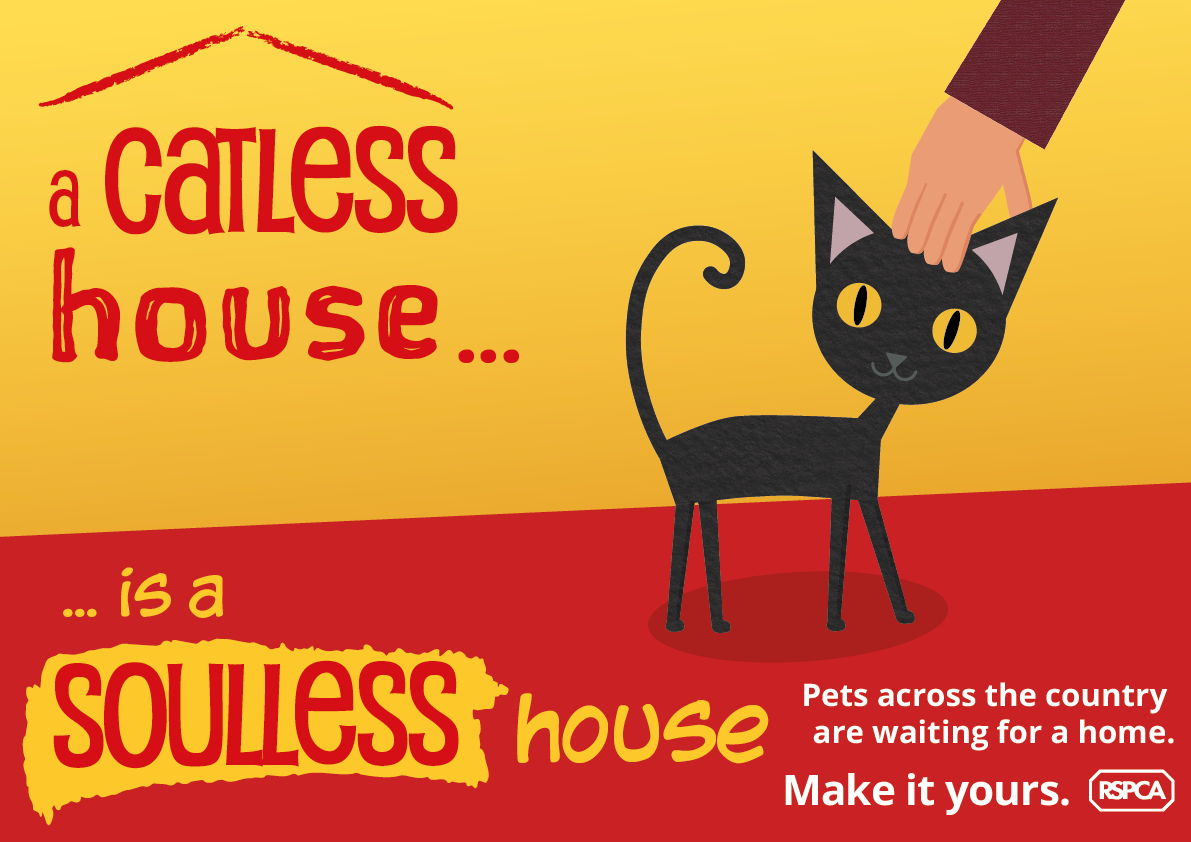
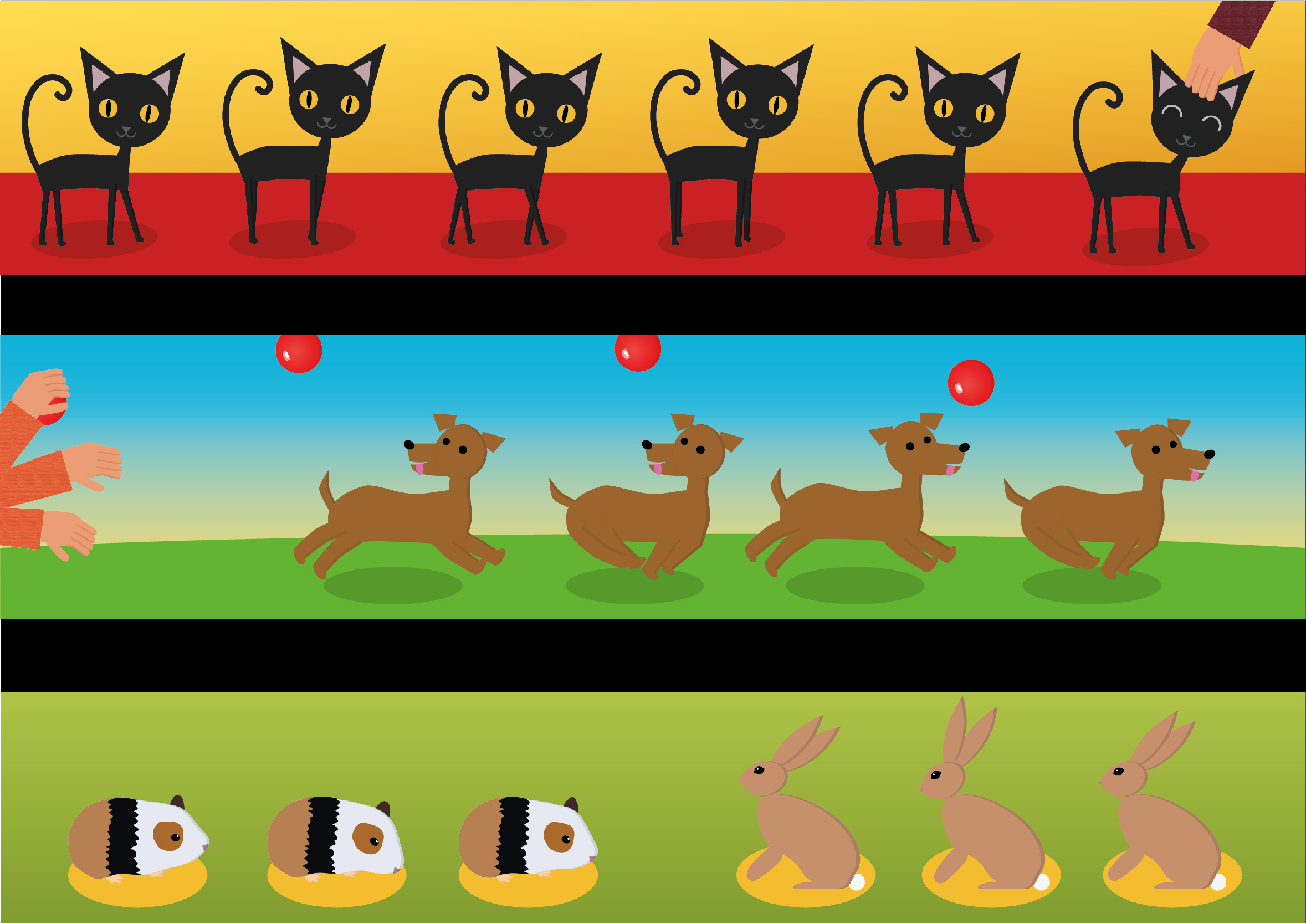
The aim of this project was to create a 360° campaign that encourages people to adopt pets. I made three posters, each featuring different animals to appeal to a wide audience.
These would be placed around public transport, vet surgeries, community centres, and retirement homes, to target adults with the means to support a pet.
Design
With the audience in mind.
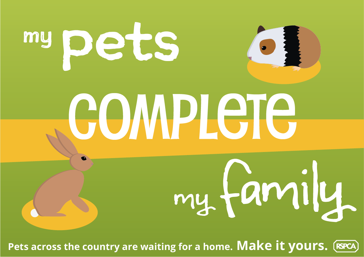
The posters use colour theory to convey the best parts of owning a pet: bright and natural for the outdoors side of owning a dog, warm and cozy for the cat.
